注:本文内容分享转载自HarmonyOS Developer官网文档
点击查看
《开发指导—利用CSS动画实现HarmonyOS动效(一)》
3. background-position样式动画
通过改变background-position属性(第一个值为X轴的位置,第二个值为Y轴的位置)移动背景图片位置,若背景图位置超出组件则超出部分的背景图不显示。
<!-- xxx.hml -->
<div class="container">
<div class="content"></div>
<div class="content1"></div>
</div>
/* xxx.css */
.container {
height: 100%;
background-color:#F1F3F5;
display: flex;
flex-direction: column;
justify-content: center;
align-items: center;
width: 100%;
}
.content{
width: 400px;
height: 400px;
/* 不建议图片长宽比为1:1 */
background-image: url(common/images/bg-tv.jpg);
background-size: 100%;
background-repeat: no-repeat;
animation: change 3s infinite;
border: 1px solid black;
}
.content1{
margin-top:50px;
width: 400px;
height: 400px;
background-image: url(common/images/bg-tv.jpg);
background-size: 50%;
background-repeat: no-repeat;
animation: change1 5s infinite;
border: 1px solid black;
}
/* 背景图片移动出组件 */
@keyframes change{
0%{
background-position:0px top;
}
25%{
background-position:400px top;
}
50%{
background-position:0px top;
}
75%{
background-position:0px bottom;
}
100%{
background-position:0px top;
}
}
/* 背景图片在组件内移动 */
@keyframes change1{
0%{
background-position:left top;
}
25%{
background-position:50% 50%;
}
50%{
background-position:right bottom;
}
100%{
background-position:left top;;
}
}
说明
background-position仅支持背景图片的移动,不支持背景颜色(background-color)。
4.
svg动画
为svg组件添加动画效果。
属性样式动画
在Svg的子组件
animate中,通过attributeName设置需要进行动效的属性,from设置开始值,to设置结束值。
<!-- xxx.hml -->
<div class="container">
<svg>
<text x="300" y="300" fill="blue">
Hello
<animate attributeName="font-size" from="30" to="60" dur="3s" repeatCount="indefinite">
</animate>
<animate attributeName="fill" from="red" to="blue" dur="3s" repeatCount="indefinite">
</animate>
<animate attributeName="opacity" from="1" to="0.3" dur="3s" repeatCount="indefinite">
</animate>
</text>
<text x="300" y="600" fill="blue">
World
<animate attributeName="font-size" from="30" to="60" values="30;80" dur="3s" repeatCount="indefinite">
</animate>
<animate attributeName="fill" from="red" to="blue" dur="3s" repeatCount="indefinite">
</animate>
<animate attributeName="opacity" from="0.3" to="1" dur="3s" repeatCount="indefinite">
</animate>
</text>
</svg>
</div>
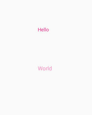
说明
在设置动画变化值时,如果已经设置了values属性,则from和to都失效。
路径动画
在Svg的子组件
animateMotion中,通过path设置动画变化的路径。
<!-- xxx.hml -->
<div class="container">
<svg fill="white" width="800" height="900">
<path d="M300,200 h-150 a150 150 0 1 0 150 -150 z" fill="white" stroke="blue" stroke-width="5" >
</path>
<path fill="red" d="M-5,-5 L10,0 L-5,5 L0,0 Z" >
<animateMotion dur="2000" repeatCount="indefinite" rotate="auto-reverse"path="M300,200 h-150 a150 150 0 1 0 150 -150 z">
</animateMotion>
</path>
</svg>
</div>

animateTransform动画
在Svg的子组件
animateTransform中,通过attributeName绑定transform属性,type设置动画类型,from设置开始值,to设置结束值。
<!-- xxx.hml -->
<div class="container" style="">
<svg>
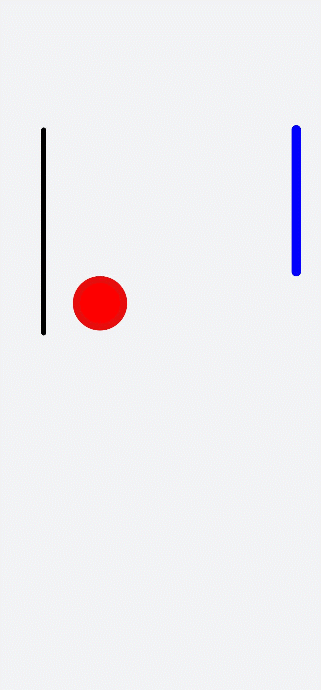
<line x1="90" y1="300" x2="90" y2="730" stroke-width="10" stroke="black" stroke-linecap="round">
<animateTransform attributeName="transform" attributeType="XML" type="translate" dur="3s" values="0;30;10;30;20;30;25;30" keyTimes="0;0.3;0.5;0.7;0.8;0.9;1.0;1.1"
fill="freeze">
</animateTransform>
</line>
<circle cx="500" cy="500" r="50" stroke-width="15" fill="red" stroke="#e70d0d">
<animateTransform attributeName="transform" attributeType="XML" type="rotate" dur="3s" values="0;30;10;30;20;30;25;30" keyTimes="0;0.3;0.5;0.7;0.8;0.9;1.0;1.1" fill="freeze">
</animateTransform>
<animateTransform attributeName="transform" attributeType="XML" type="scale" dur="6s" values="1;1;1.3" keyTimes="0;0.5;1" fill="freeze"></animateTransform>
<animateTransform attributeName="transform" attributeType="XML" type="translate" dur="9s" values="0;0;300 7" keyTimes="0;0.6;0.9" fill="freeze"></animateTransform>
</circle>
<line x1="650" y1="300" x2="650" y2="600" stroke-width="20" stroke="blue" stroke-linecap="round">
<animateTransform attributeName="transform" attributeType="XML" type="translate" dur="9s" values="0;0;0 800" keyTimes="0;0.6;1" fill="freeze"></animateTransform>
</line>
</svg>
</div>
/* xxx.css */
.container {
flex-direction: column;
align-items: center;
width: 100%;
height: 100%;
background-color: #F1F3F5;
}